THE BRIEF:
When Jessica started her business, no one was teaching the less glamorous (and many would say less profitable) foundations of building a solvent and sustainable business — so she literally made it her business to fill that gap.
Approaching her next level of visibility with an upcoming book launch, it was time to own the depth and breadth of her experience, both formal and non-traditional, and take up space as the wise, timeless, invaluable 100-year oak that her body of work is — especially when compared to the wily wolves preying on inexperienced business owners.
We needed to root and stabilize her visual identity to match the groundedness of her work, establishing longevity and legacy beyond a fresh, flashy facelift.
THE RESULT:
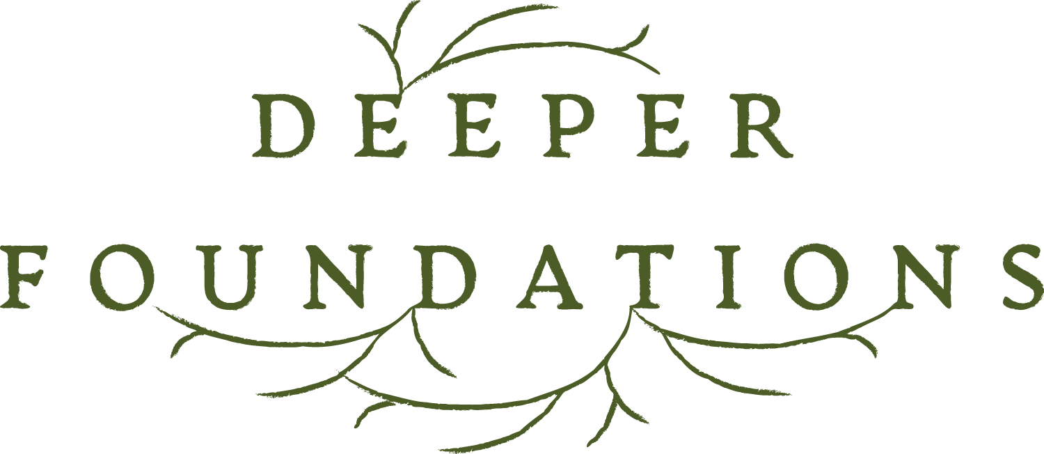
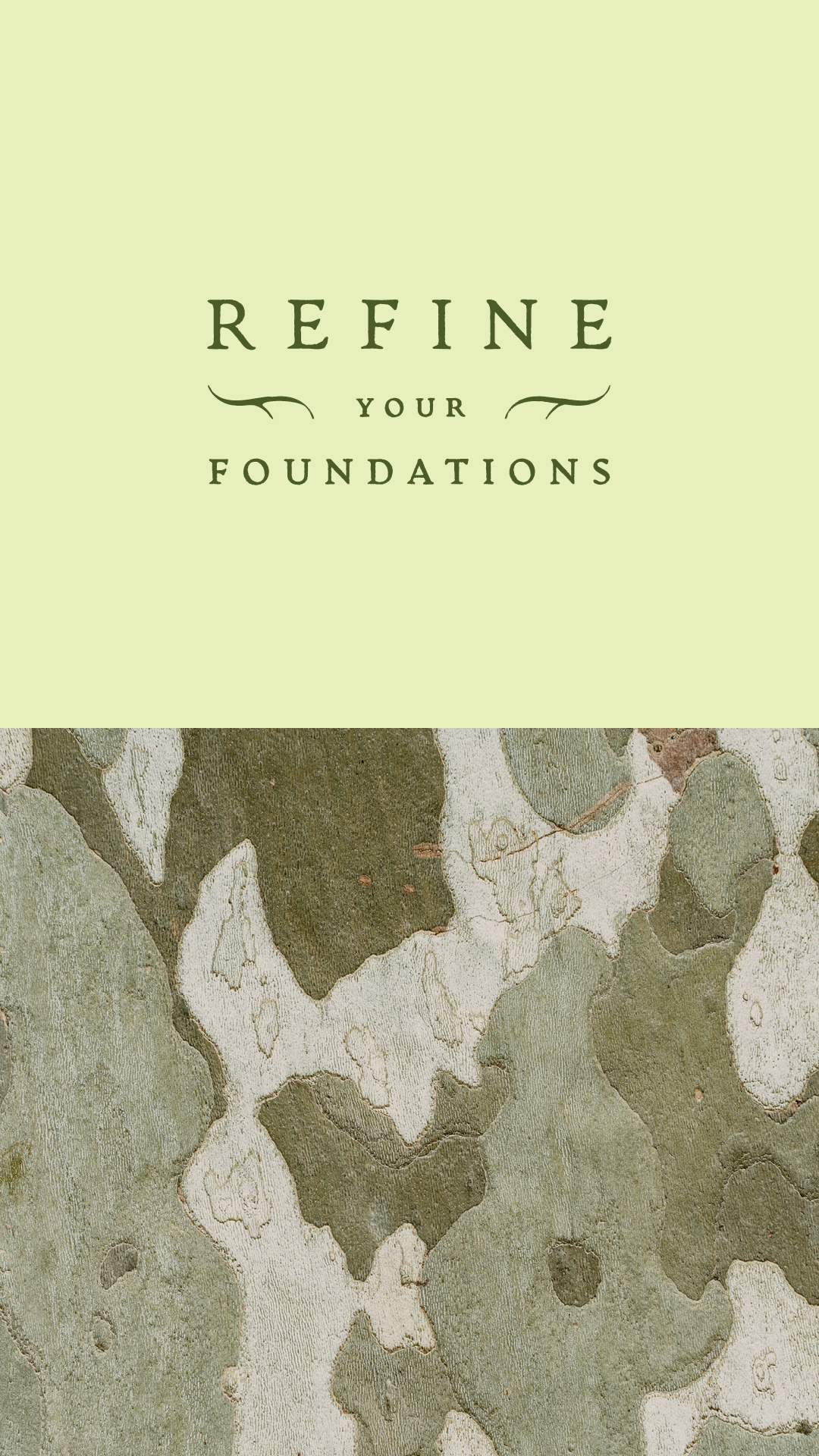
Business foundations as a force of nature.
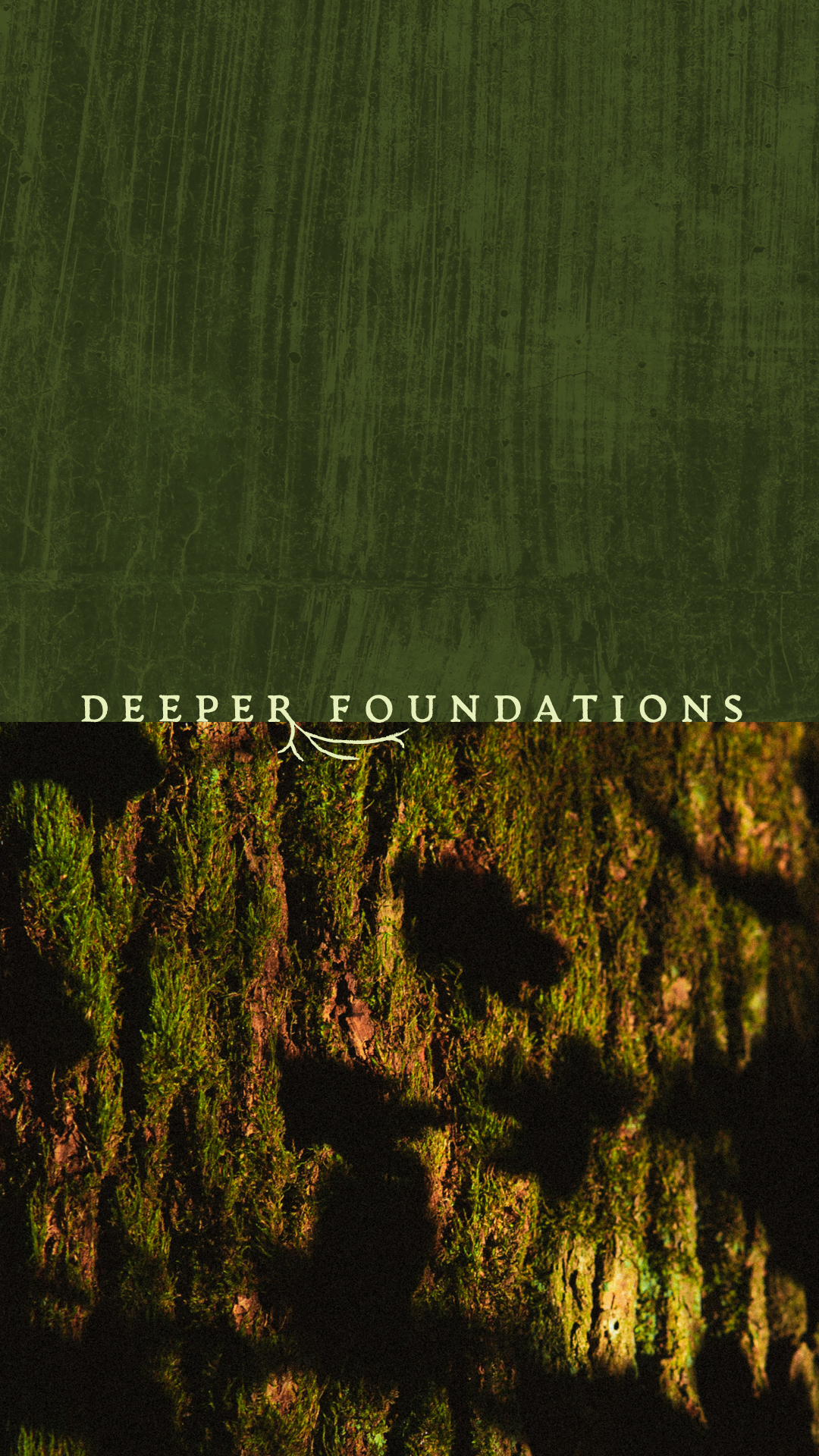
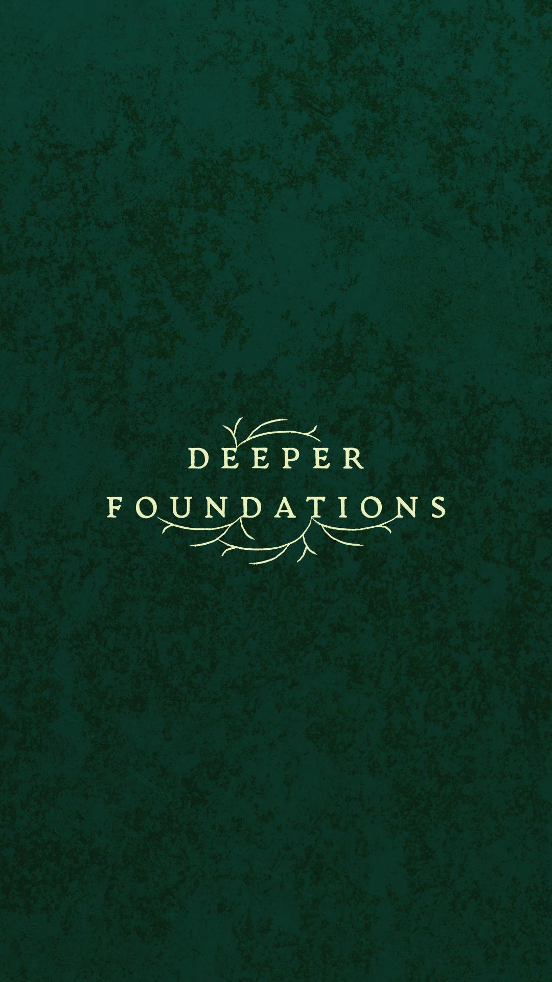
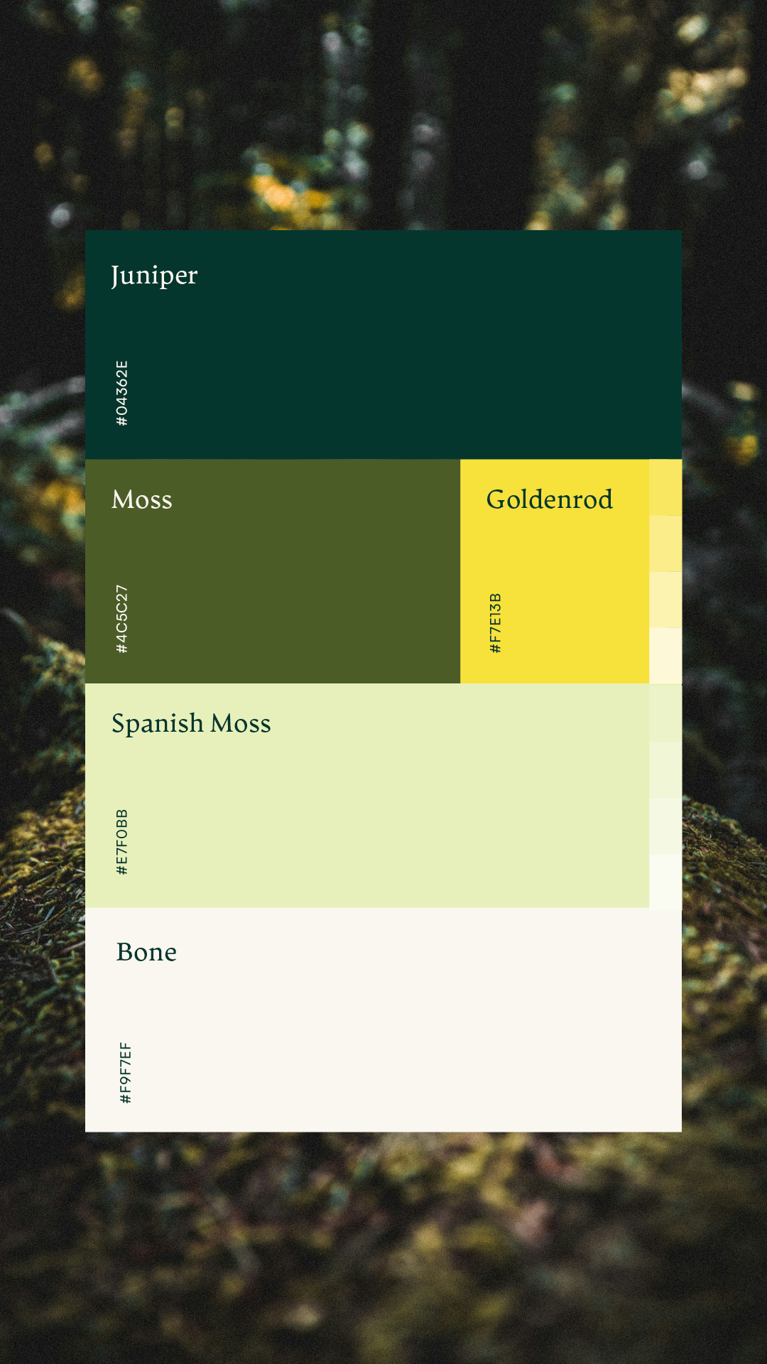
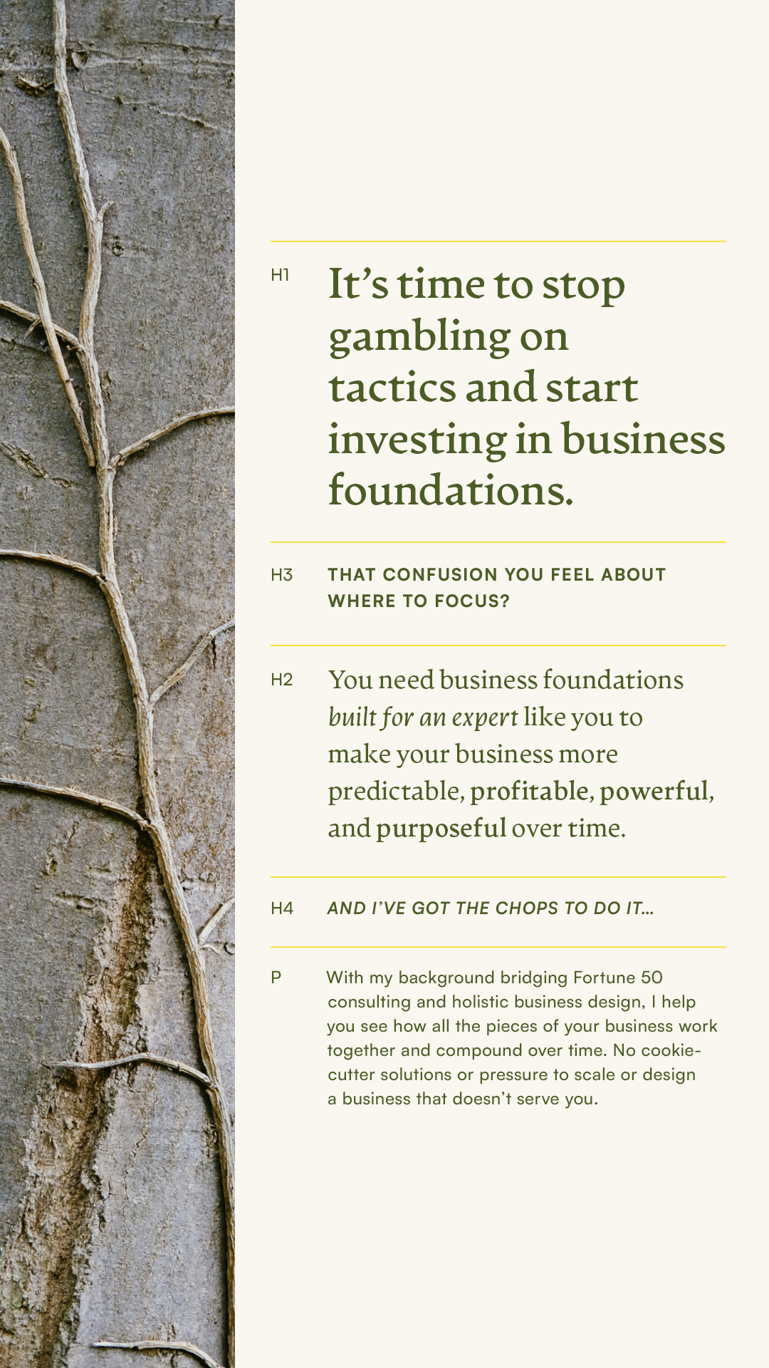
The foundation of the brand feels formal: Artifex CF as a unique yet grounded serif anchoring headlines, Satoshi as a versatile sans serif for body text, and a deceptively simple, green-forward color palette.
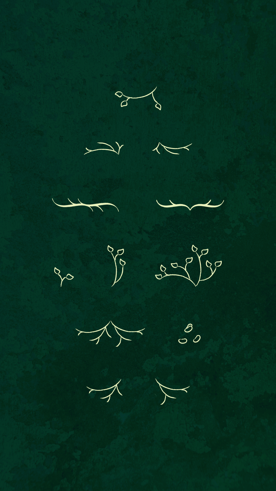
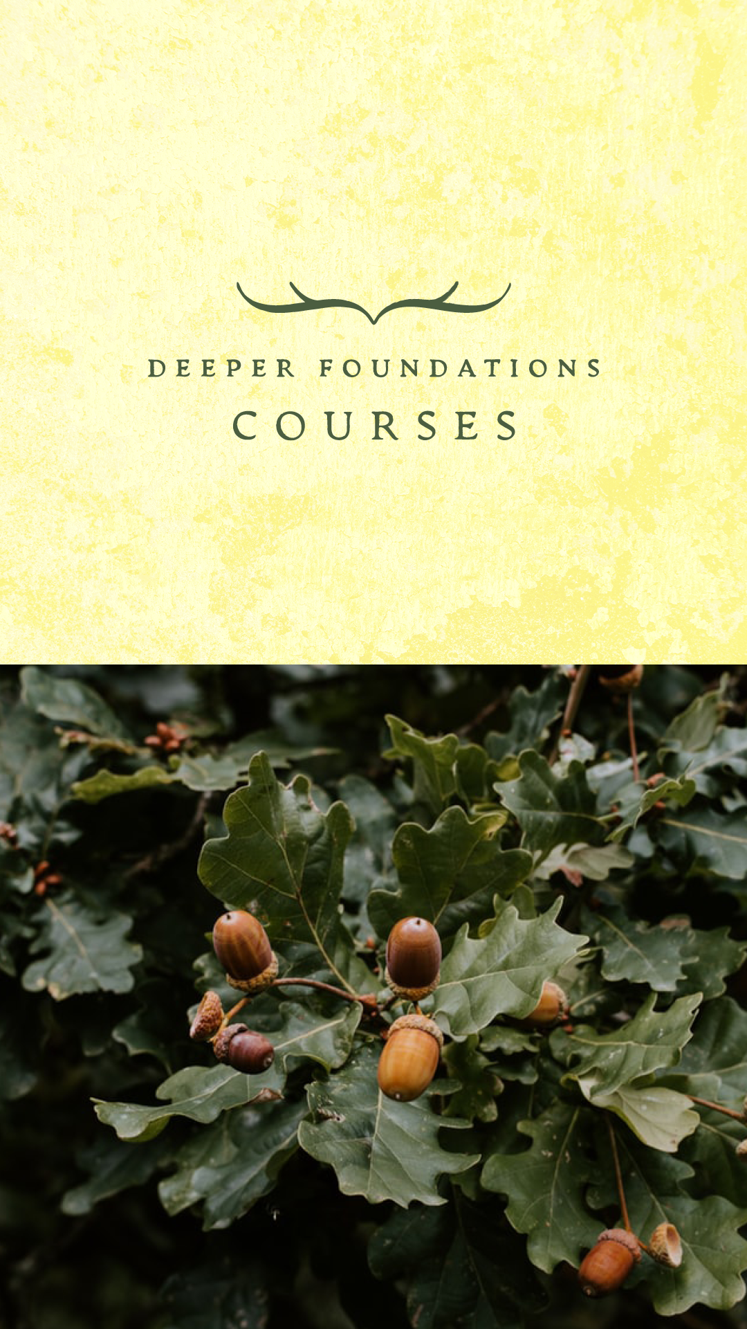
But, overgrown with organic and gritty details, the “rules” of tranditional corporate branding crumble under unexpected contrasts: rich background textures, roots, moss, and forest-scapes overtake the look and morph it into something much wilder.
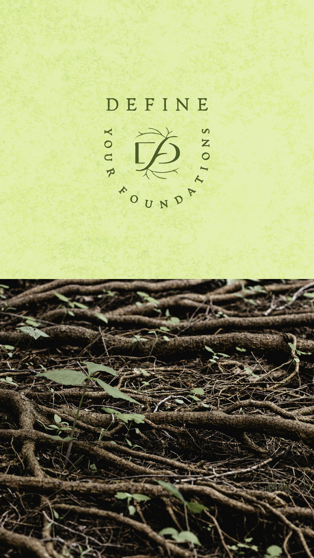
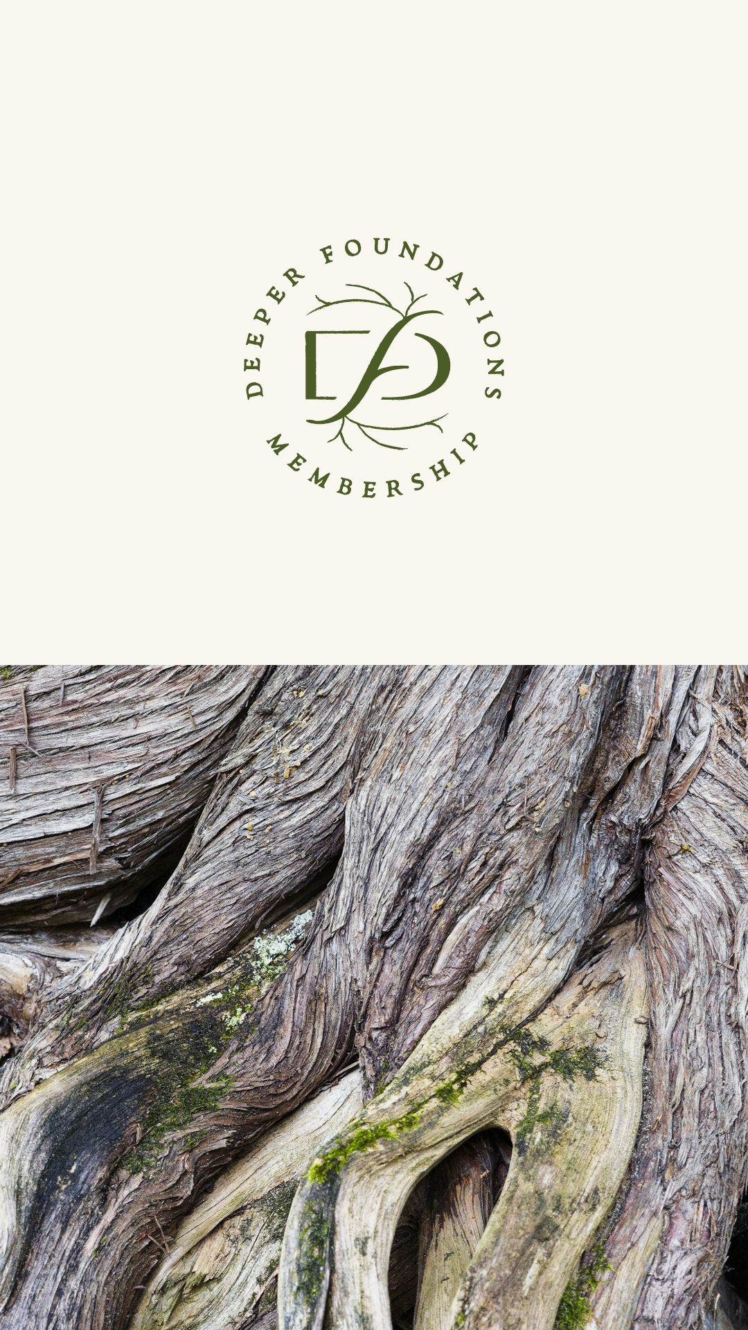
In the monogram, the rooting and branching of the organic “f” breaking through the contained structure of the “D” suggest reaching deeper in order to reach higher.
By visually combining the stable strength of structure with imperfect, organic complexity, the overall effect drives home the bold-yet-practical promise of Deeper Foundations: stop gambling on shiny, surface-level tactics and dig deeper to build a sustainable foundation that stands the text of time.
See the brand in action: deeperfoundations.comBRAND ELEMENTS:
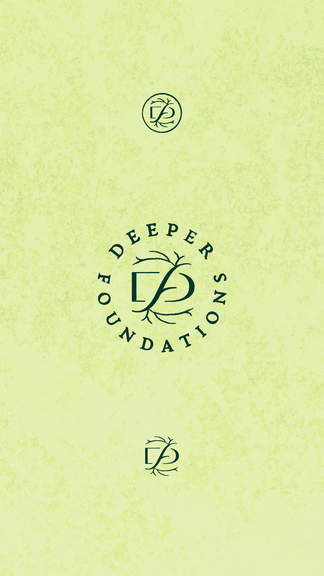
OFFER SUITE LOGOS:

TESTIMONIAL

“I had a number of choices to work with, but Sharon's portfolio just shimmered with power, and that's how my brand feels now.
Grounded, powerful, and a force in my business.
I am in a big season of upleveling in my business: shifting my business model for more scaled offerings, releasing my book, and showcasing my intellectual property. Additionally, I had moved beyond my 1.0 brand into a company and brand name that highlighted my distinctiveness.
My old brand was serviceable and recognizable but couldn't grow with me, specifically with some of the typography. I chose to work with Sharon because I knew she could take what was working about my brand and elevate it with sophistication to a new level.
I am discerning about who I work with because their process needs to be on point, not just their outputs, and at every step I knew what to expect from Sharon.”
— Jessica Lackey
PRESENTATION TEMPLATES: