
THE BRIEF:
Break Emma out of the “weirdo” closet to distinguish her from competitors and allow her to show up fully inspired — with her clients, on the internet, and in her life.
Emma came to us feeling so uninspired about her work and her marketing, and upon getting to know her, it became very clear why: she wasn’t showing up as herself.
She’s a musician, traveler, and overall weirdo with incredible taste — but was afraid to show it for fear of scaring away her impressive roster of high-ticket clients.
As Emma put it, vanilla still worked for her clients, but wasn’t working for her anymore — which meant it wasn’t working.
THE RESULT:
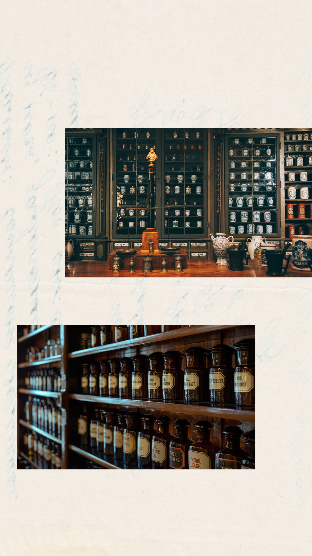
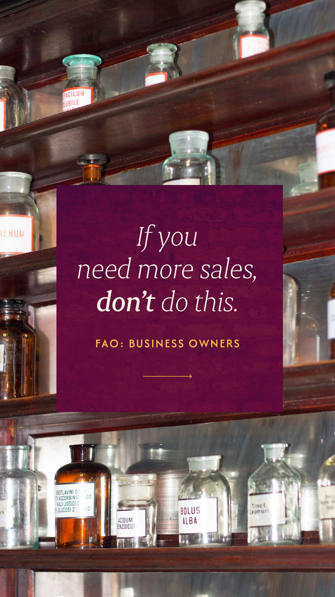
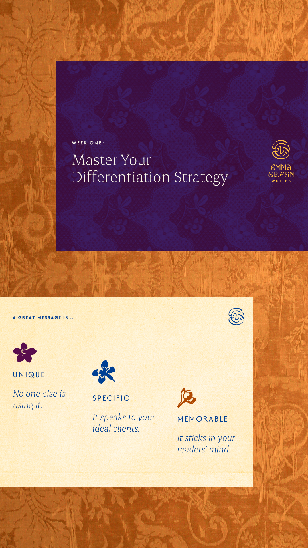
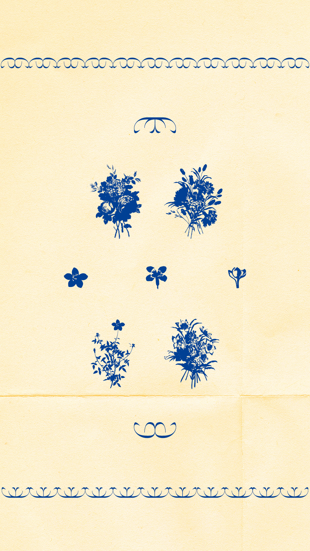
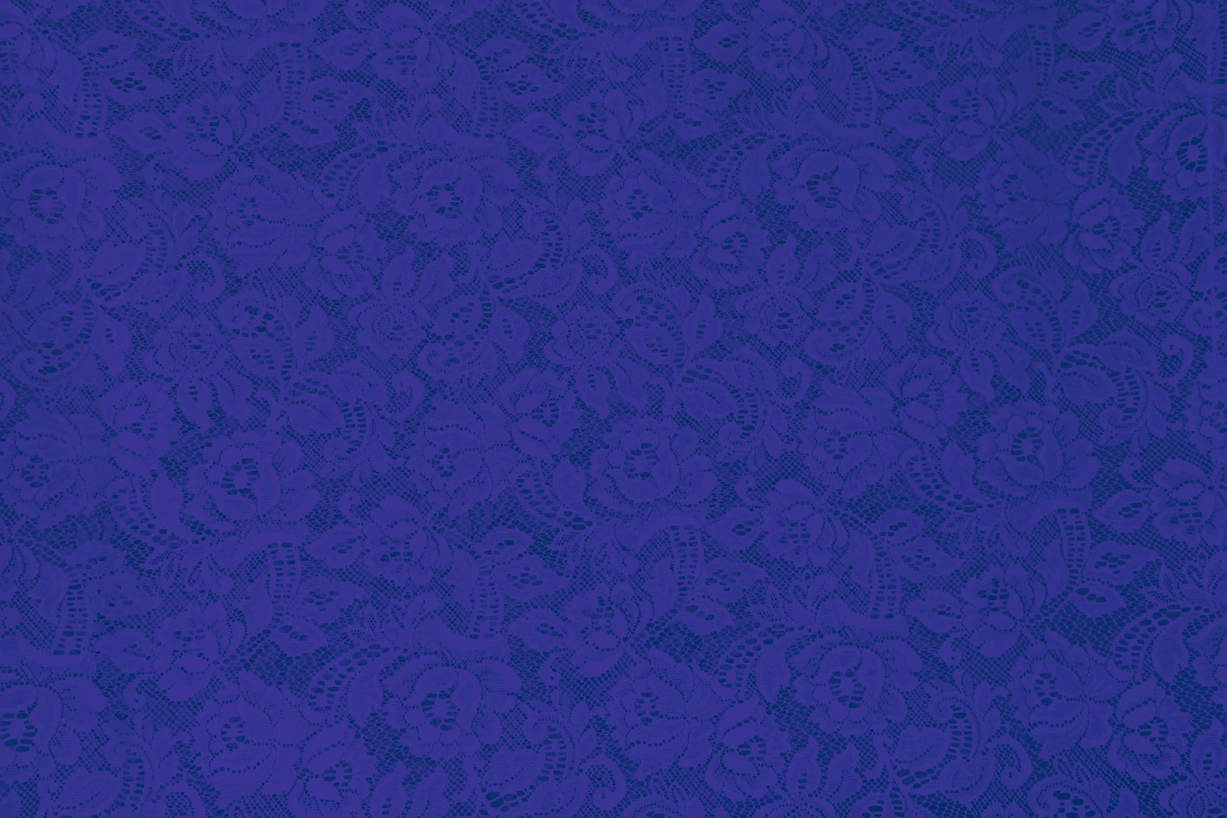
An elixir of intrigue, layers & lace.
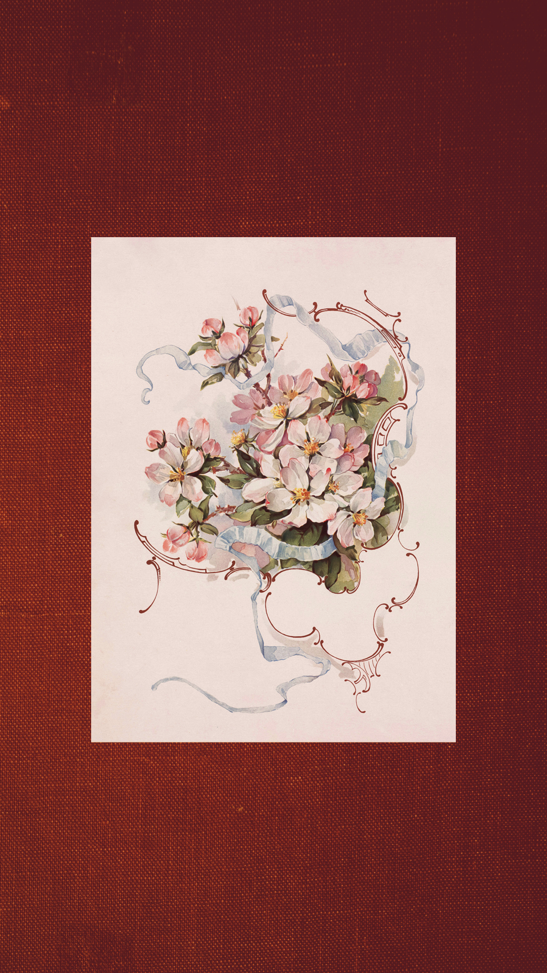
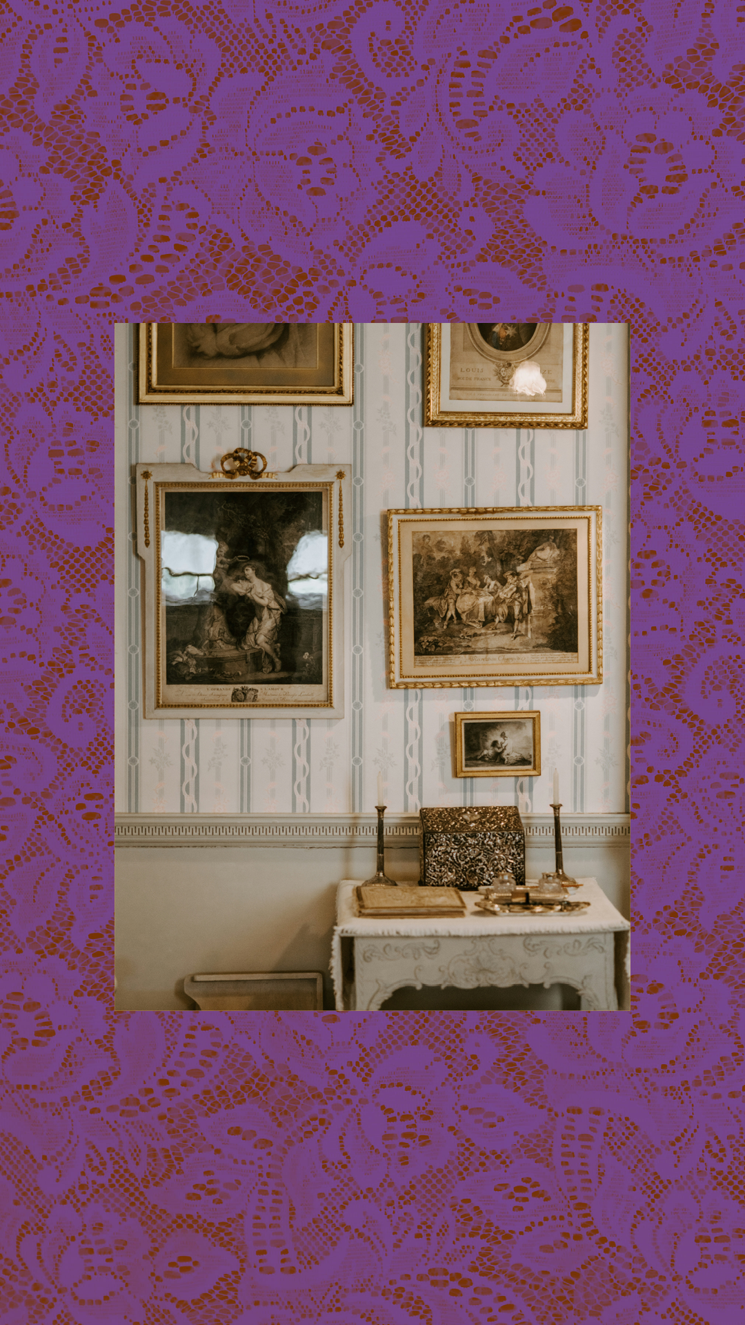
Aged lace, florals, paper, and texture add up to a maximalist look that marries the busy, flowing quality of the Victorian-era Arts and Crafts movement to the bruised grit and textures of 90s grunge.
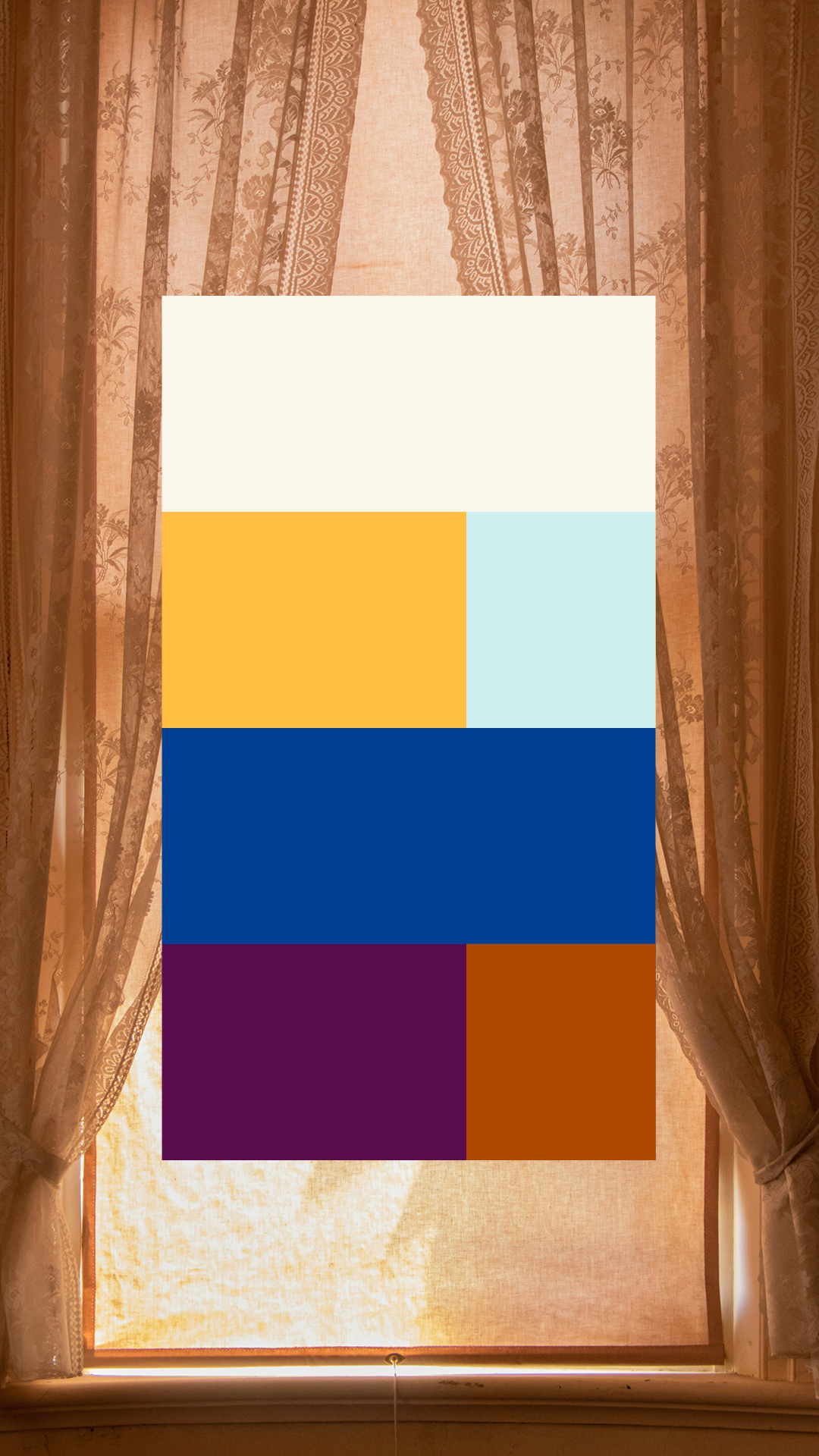
Luminous jewel tones further modernize and embolden the brand feel, with nods to the warm, aged tones of vintage ephemera.
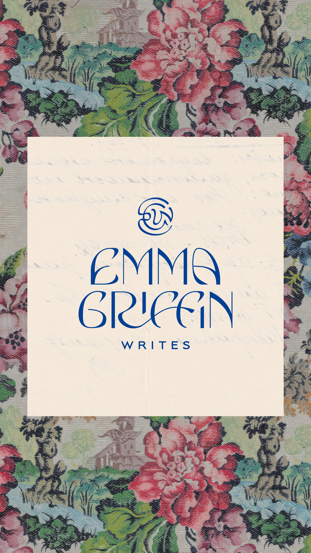
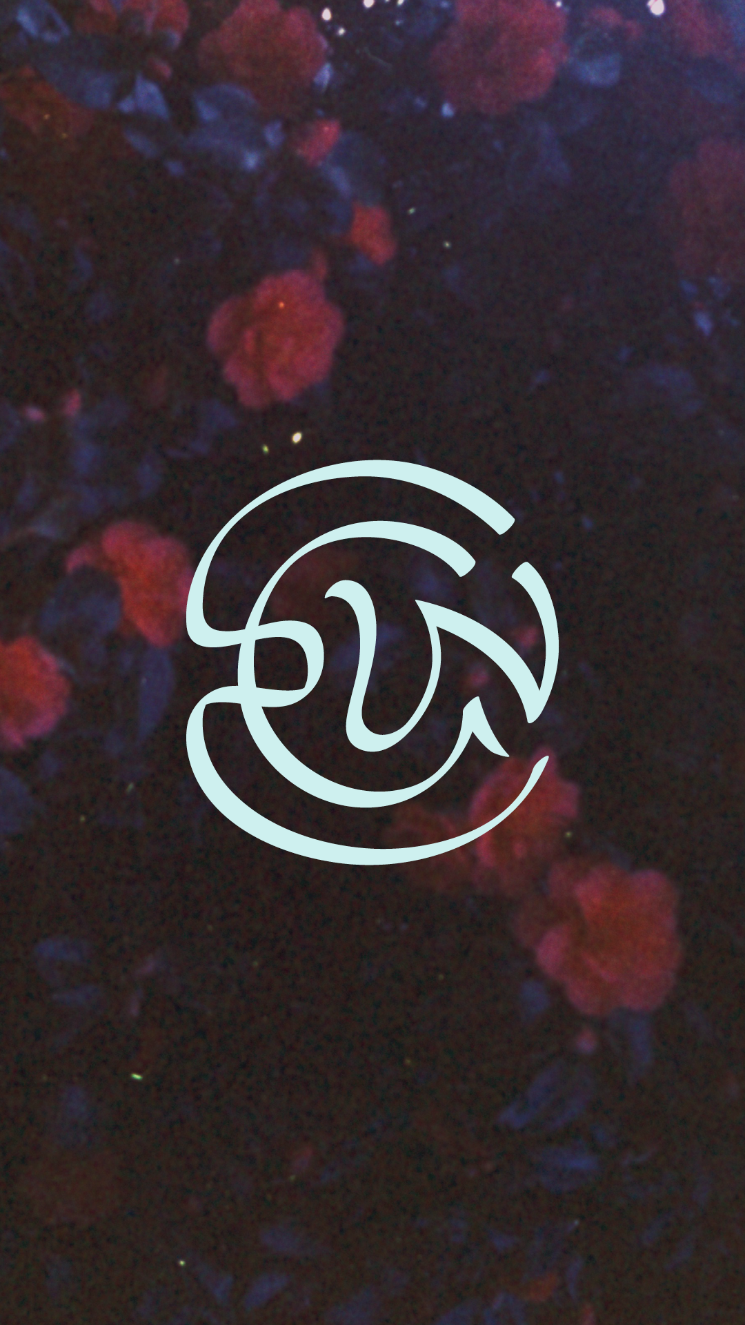
The logo system and accents are directly inspired by organic, experimental Art Nouveau lettering, modernized with extra spaciousness. Typography stays clean and flexible allowing the funkier brand elements to shine.
The rich detail and lush layers of the brand reflect the level of nuance, craft, originality, and creative edge in Emma’s signature hook strategy formula.
See the brand in action: emmagriffinwrites.co.ukLOGO + ACCENT SUITE:
TESTIMONIAL
I wanted a business that felt like me again -- not an idea of me that had been carved out based on what was more likely to please the algorithm.
After revisiting my business' positioning, packages and messaging, I knew it was time to finally invest in brand design to tie everything together and make sure my visual brand didn't let me down.
Up until reaching out to Sharon, I'd been running a successful copywriting business for 6 years and had never so much as invested in a logo! Instead, my VA and I had largely DIYed the look and feel of everything -- but it was pink and cutesy and girly and it didn't really reflect ME -- or make me stand out. I'm a bit weird, but my brand was still very much giving "boss-beige".
Going into 2025, I wanted something bold and different. Something that tied together my disparate interests and influences and made me stand out from the standard "working at my laptop with coffee" brand identities that most copywriters end up with.
My brief was pretty chaotic and weird but from the first call we had, I knew Sharon got it. To be honest, since discovering her work a few months before, there was no one else even on my radar for my rebrand. I was drawn to how unconventional her design eye was, and knew that settling for anything less would feel like a cop out.
Fast forward a couple of months, and I couldn't be happier with the brand identity she has come up with. She turned all the jumbled influences I held in my head (grunge, Victoriana, apothecaries and jazz clubs, anyone?!) and actually made it work together for a copywriting business. I'm overjoyed -- and I've never seen anything even slightly similar in the online space. Thank you thank you thank Sharon! I'm so excited to finish off my rebrand and head into the rest of this year with a totally upgraded look.
Sidenote -- Sharon's processes and boundaries are watertight. From the onboarding to the contract to the timeline, there was never a single point in the project where I didn't know where we were at and what to expect. As a result, Sharon was able to go deep into the design hole for weeks at a time, without me ever wondering when I'd hear from her. I used to think my own processes were pretty solid, but working with Sharon has shown me how they can be even better.