THE BRIEF:
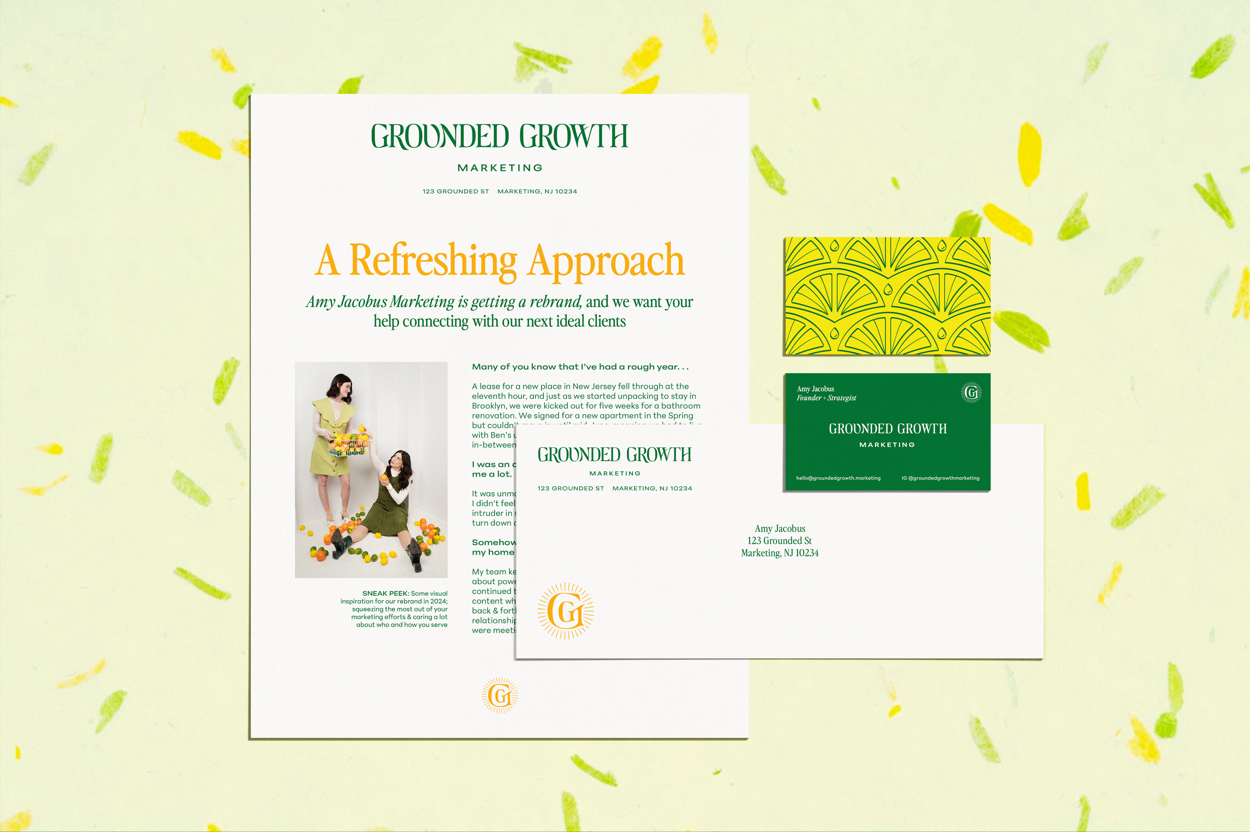
Bringing a brand-new photoshoot, color palette, and typographic direction to the table, Grounded Growth Marketing needed a final logo suite, doodads, and tweaks to make everything to bring the identity to life, while keeping all elements accessible and easy to implement.
As a team of lifelong dancers, they brought a fresh, movement-forward sensibility that required high attention to detail to execute, while the end result needed to convey fun, effortless elegance.
THE RESULT:
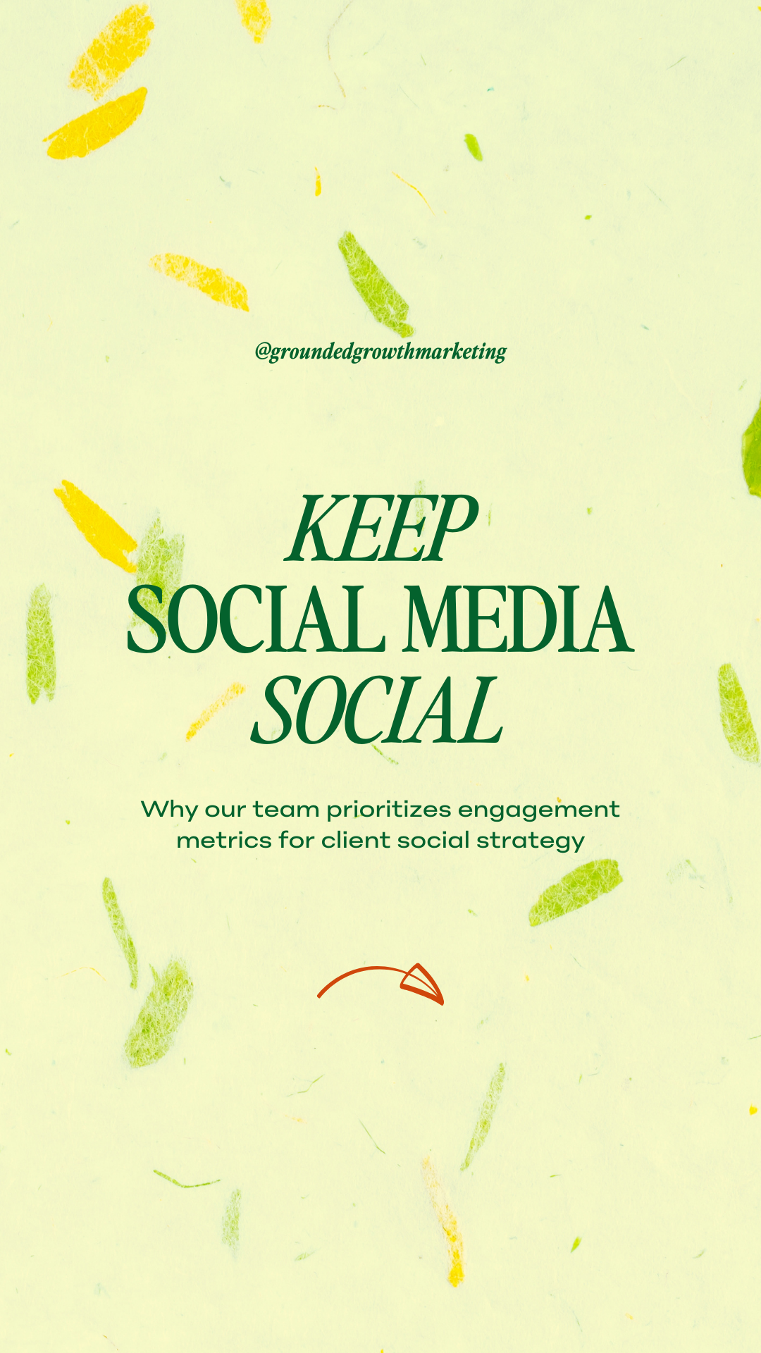
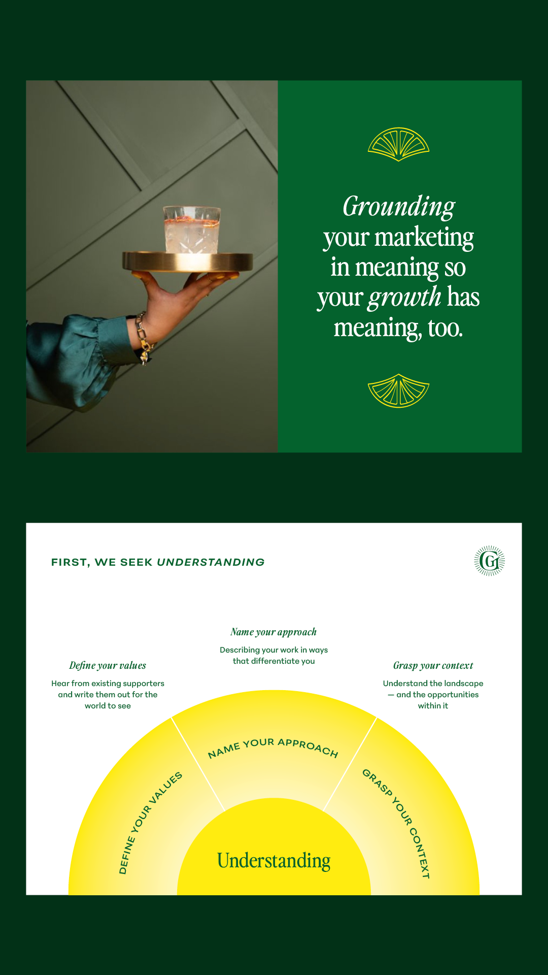
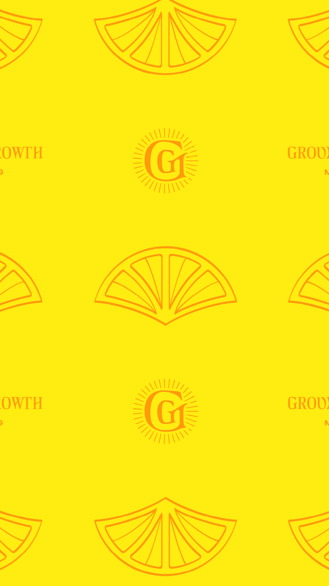
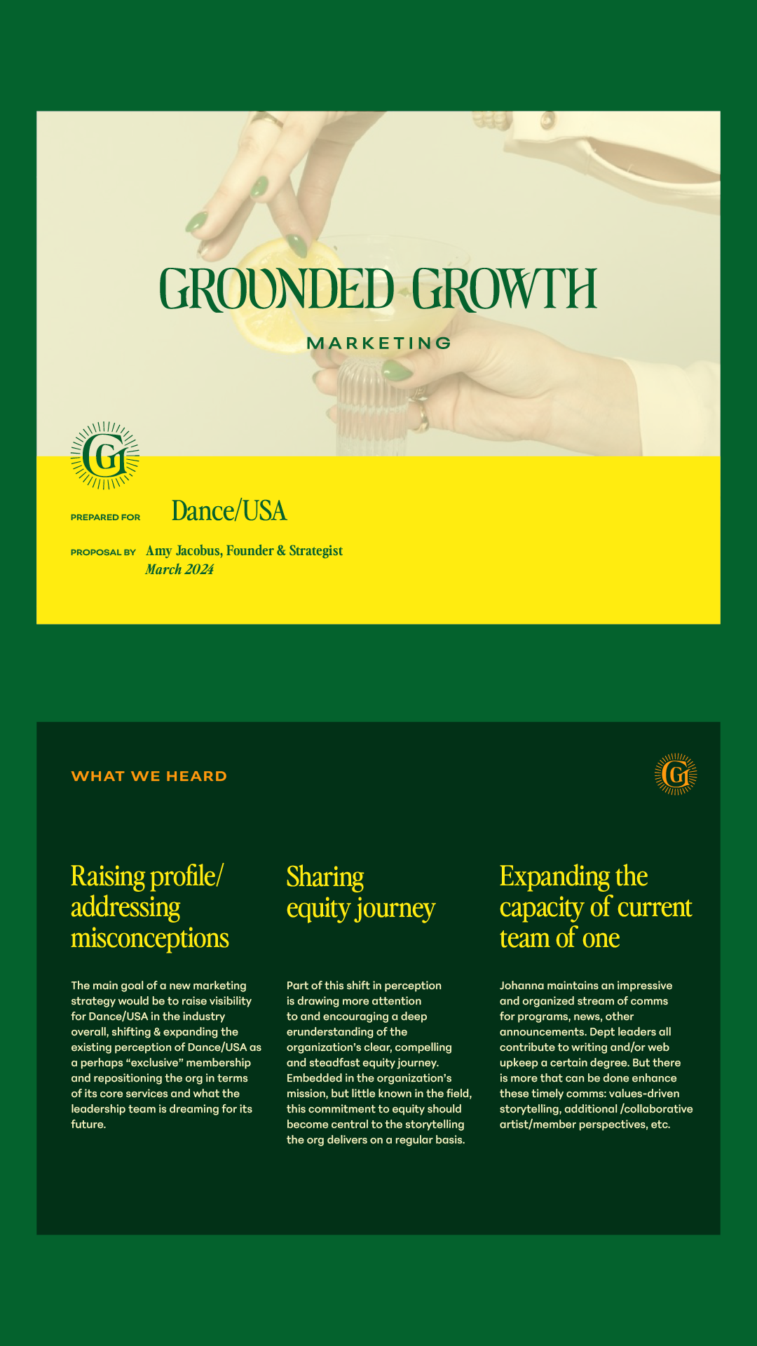
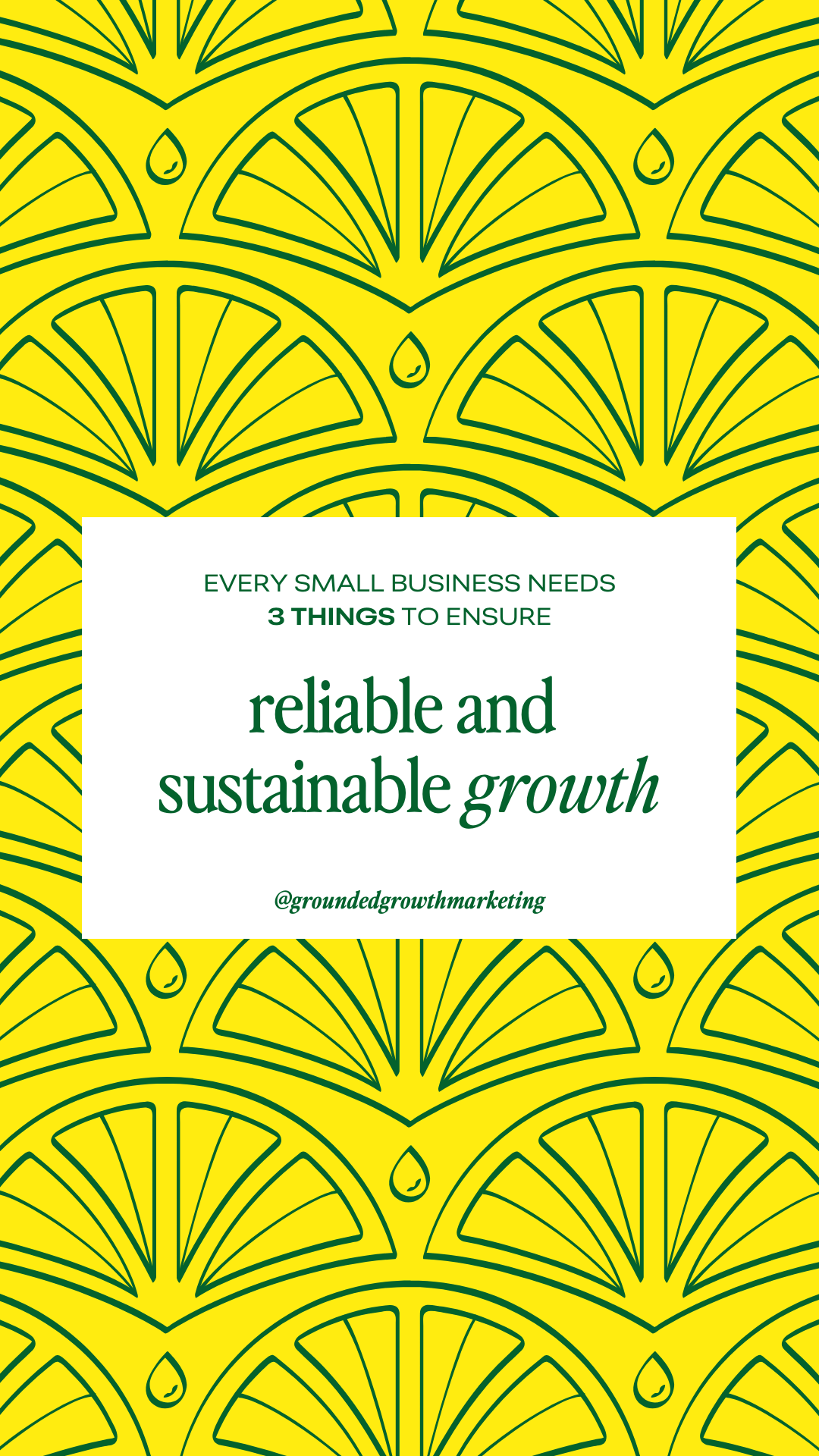
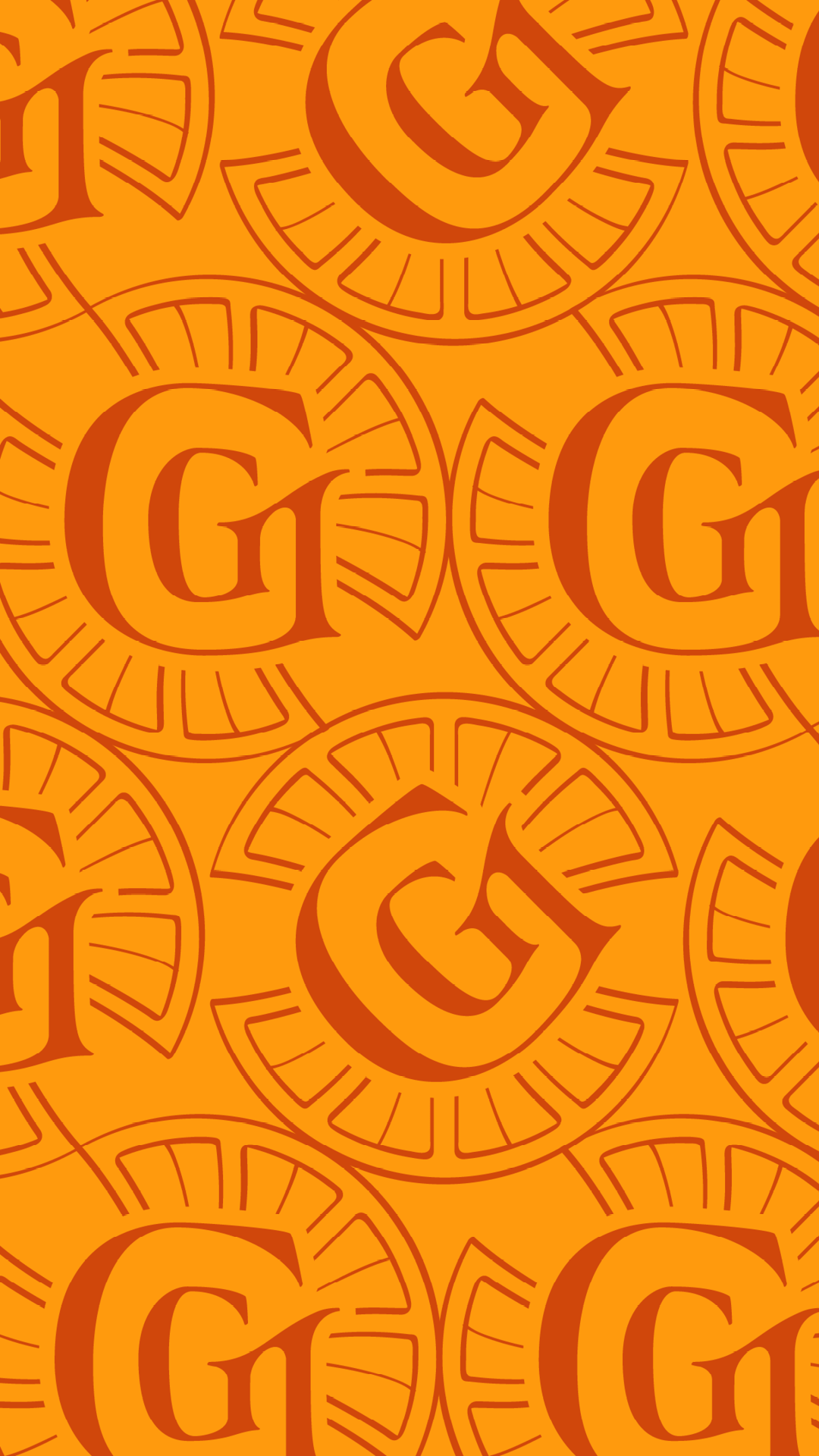
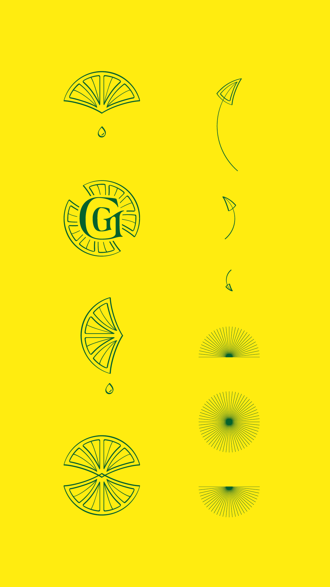
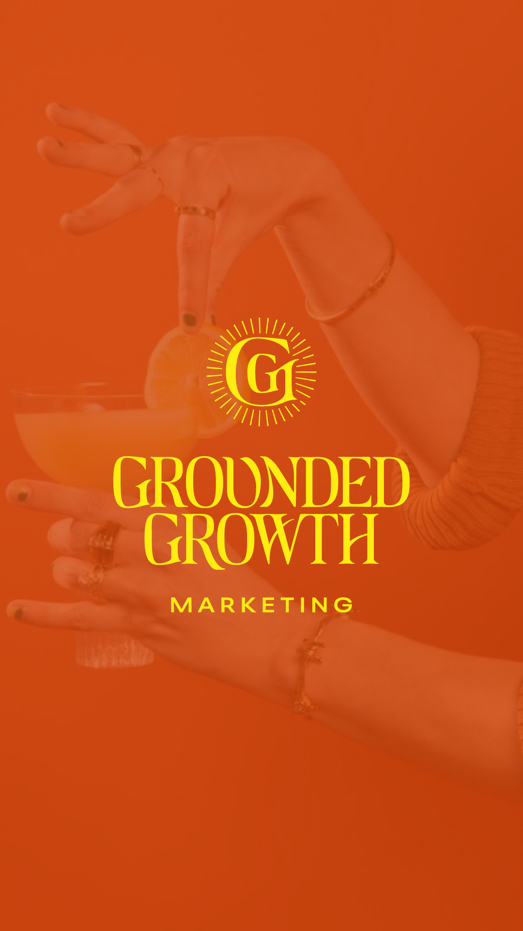
Inspired by the movement and flow of Art Nouveau, the logo and accents incorporate varied line weights and intentionally-imperfect curves and flourishes that draw the eye through logos and patterns.
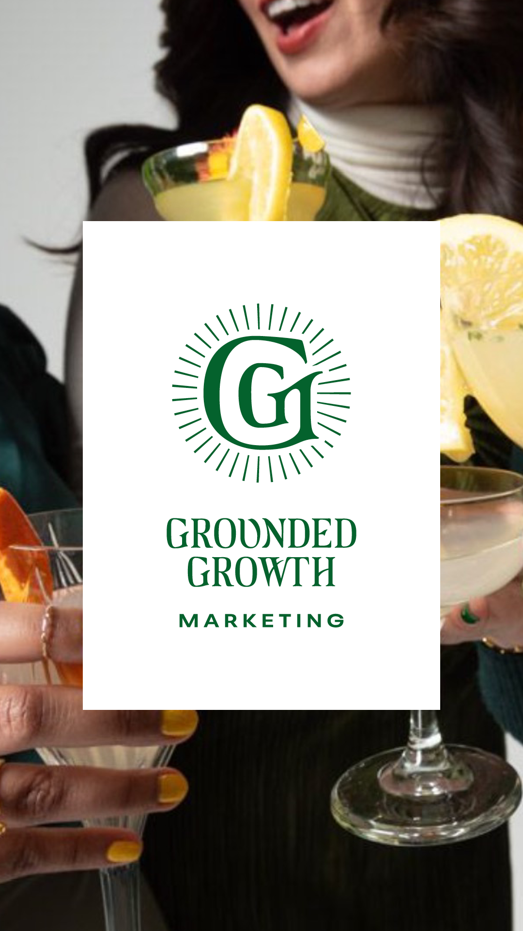
The logo suite elements are threaded through other brand accents: patterns, icons and doodads of all kinds that add more depth and playfulness than "just a logo" and some photography.
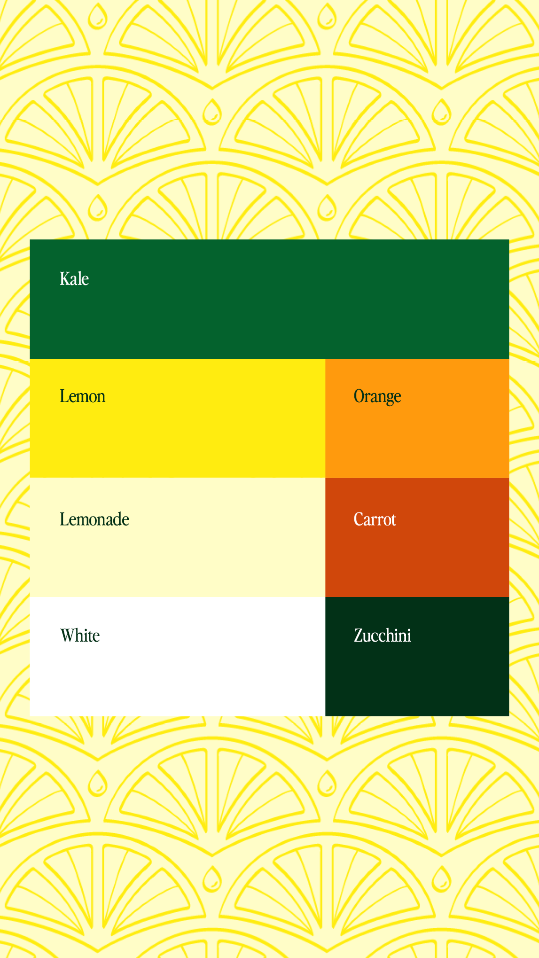
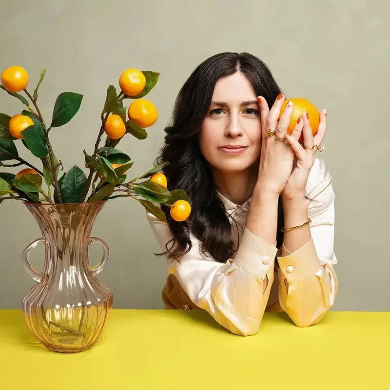
The color palette was first imagined by Hillary Weiss for the brand photoshoot, which was tweaked it slightly for accessibility while keeping the original inspiration of fresh, sweet, juicy citrus: an orange slice squeezed to the last drop.
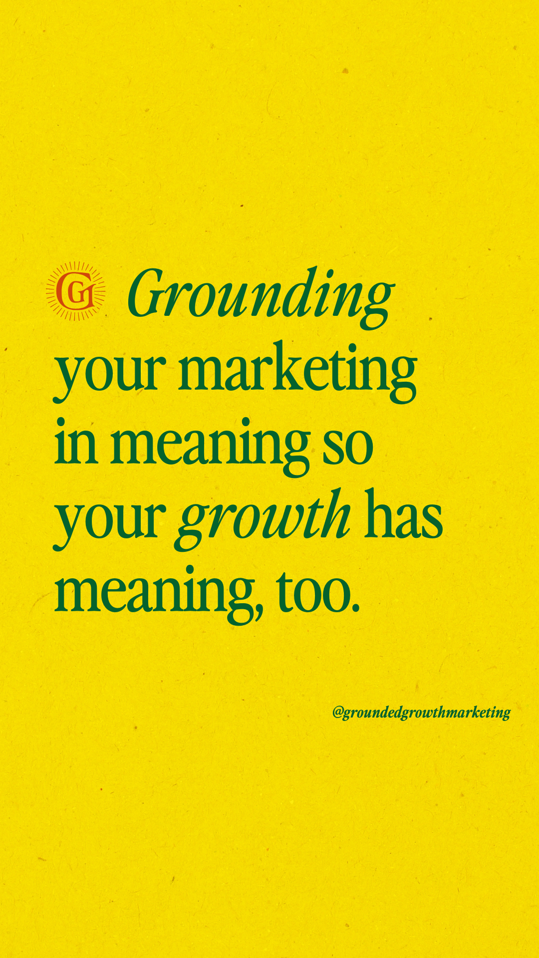
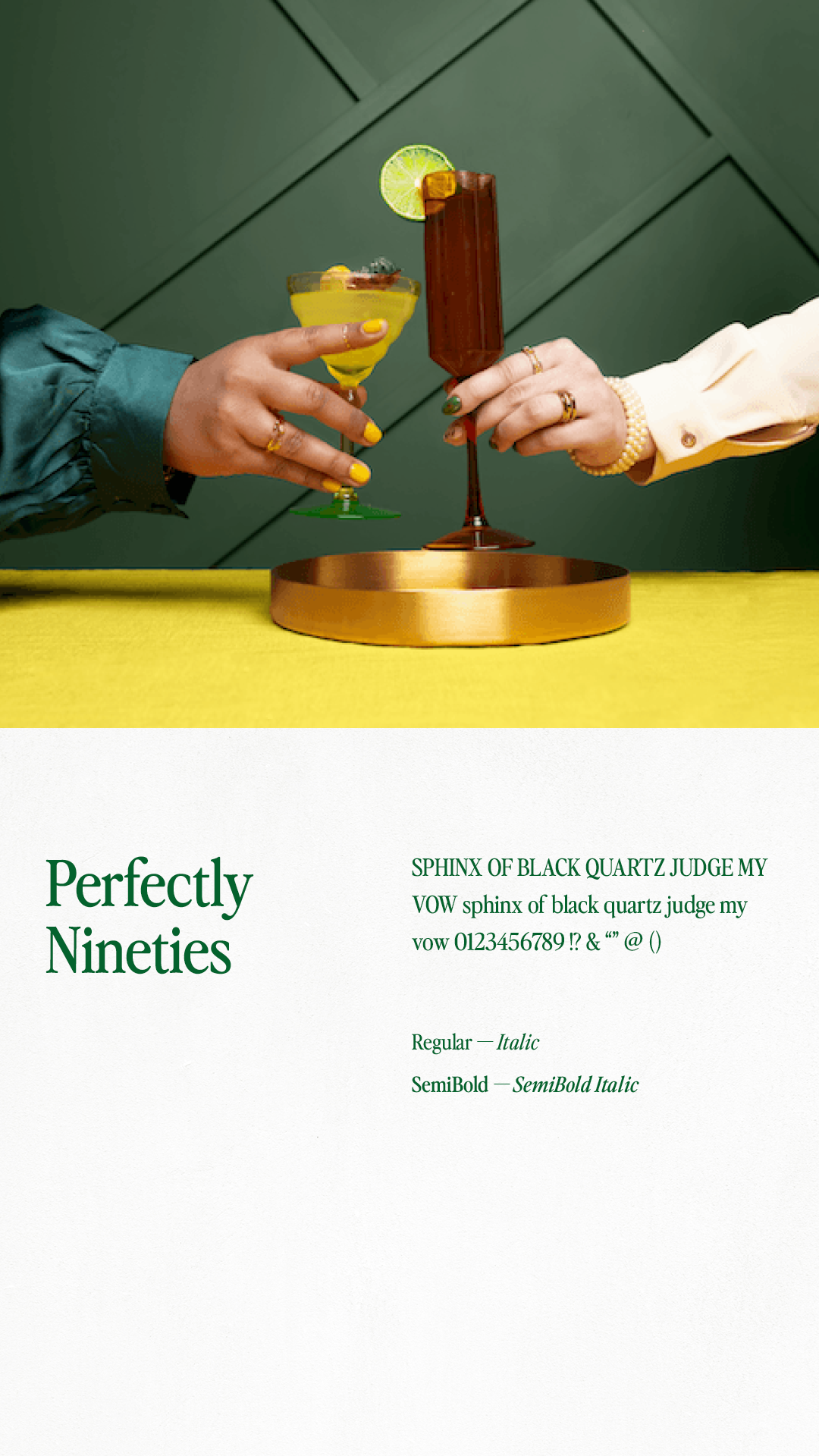
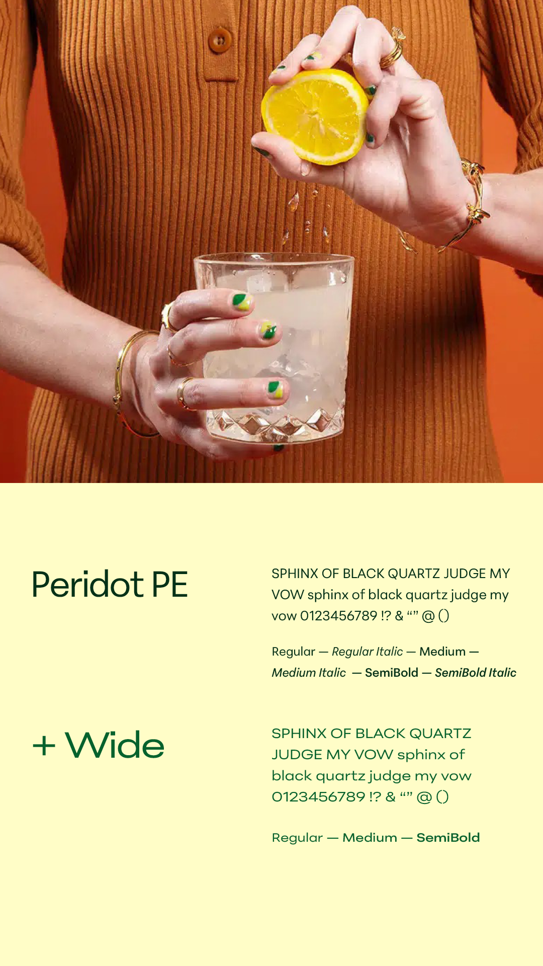
Modern, versatile typography lets the color and details shine and allows the eye to rest. Paper textures lend tactility to the ultra-bold palette, and a hint of sunny vintage juice cartons.
See the brand in action: groundedgrowth.marketingCREDITS:
Strategy + Creative Direction by Hillary WeissLOGO SUITE + BRAND ELEMENTS:

TESTIMONIAL
“Working with Sharon on our rebrand was a seamless and delightful experience from start to finish.
We came in with some existing creative direction, and she integrated those ideas with genuine collaboration and curiosity—two things we really value on our team. We felt heard and seen throughout the entire process, which made it so easy to trust Sharon with helping to define our identity as a company.
The deliverables were gorgeous, thorough, and ready to implement right away across our web and social content. We didn’t expect to receive so many intricate patterns and textures alongside a new logo, fonts, and colors. Our website designer even said it was the best brand guide she’s ever received.
Sharon’s communication was clear and intentional, both in meetings and via email. She listened to our feedback and provided thoughtful, detailed options that reflected exactly what we discussed and brought our vision to life in ways we hadn’t imagined. The end result is a brand design that captures the essence of who we are—sophisticated, refined, fresh, creative. We’re obsessed.
We’ve already hired her for additional work, and I think she’s stuck with us now, for projects forever into the future!”